
Edible Book Fest is a festival in Roger William University where Graphic Designers will create edible artworks by using books and storytelling,
In the past couple of weeks, I have done experiments on different types of typography, which involves food, 3D materials, and deciding the words! Each experiment has 25 to be done. Here are a couple of images to showcase the experiments.
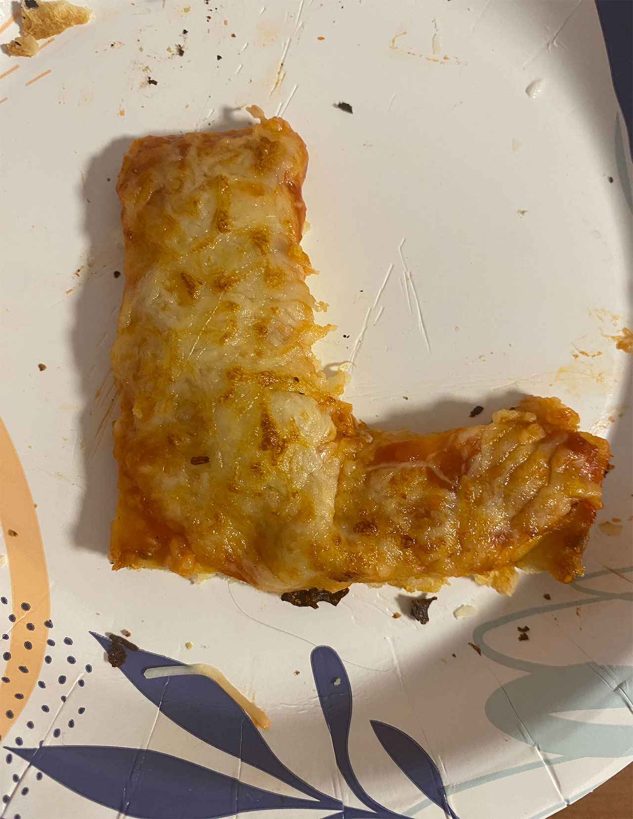
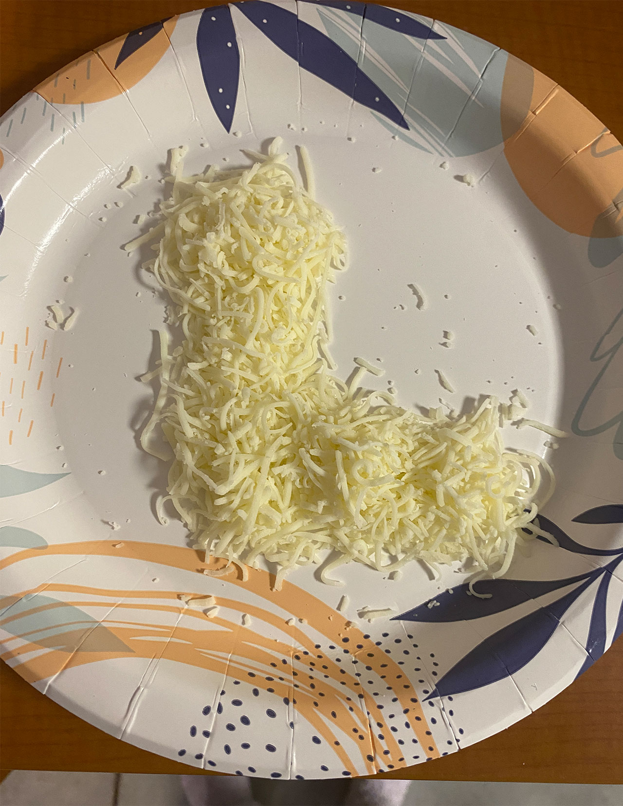
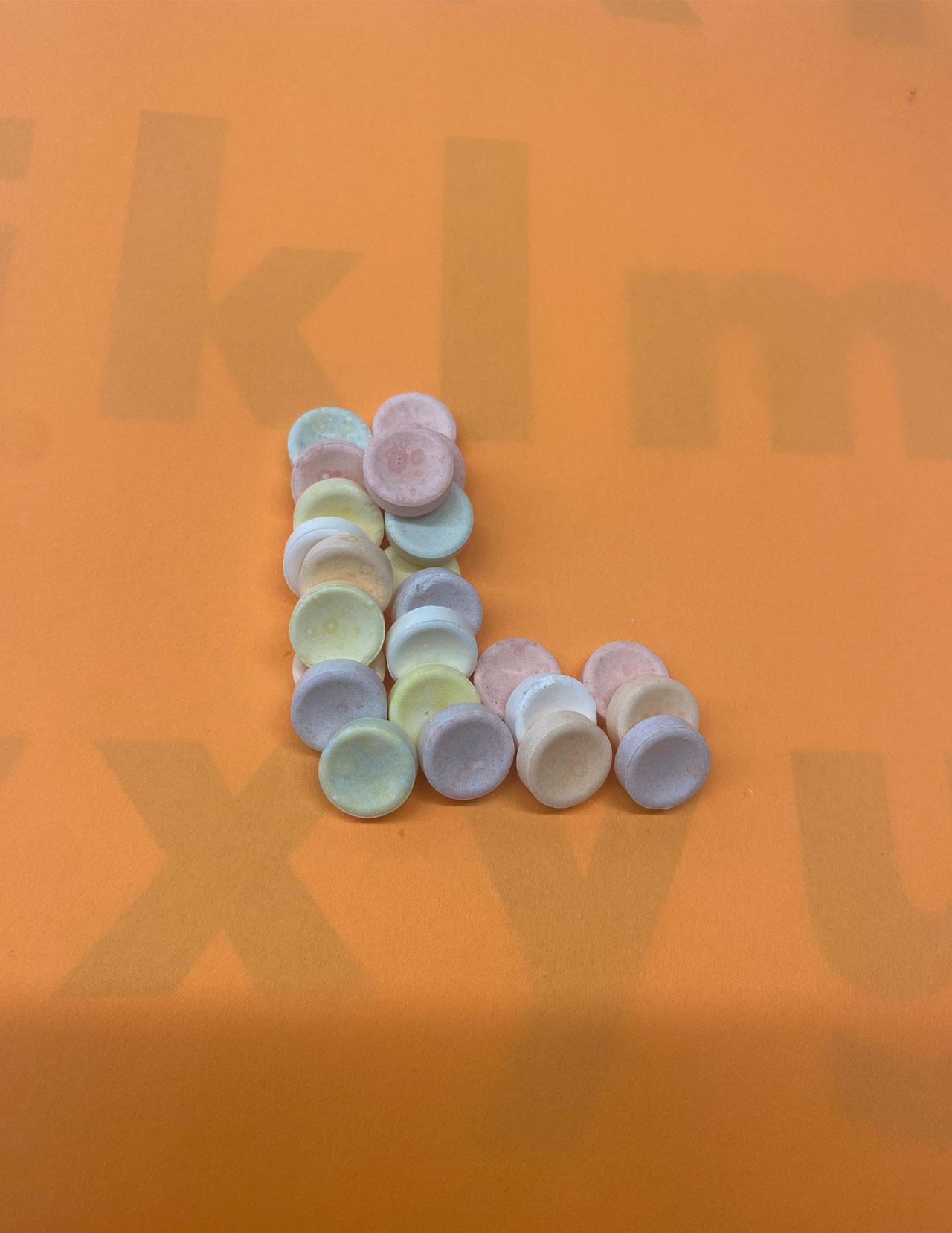
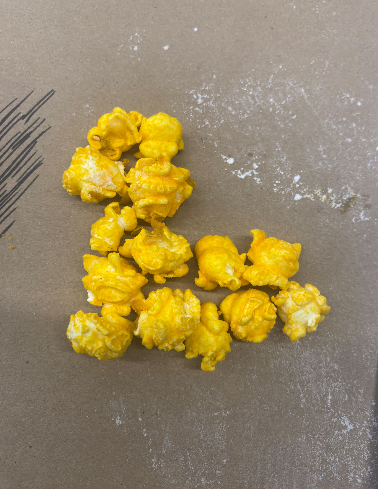
Phase 1 of experimentation involved food! I found some food and snacks around my dorm room and created the letter “L.” I used popcorn, smarties, and cheese, and I also made pizza. It did take some time to make the pizza, but I was able to do it!
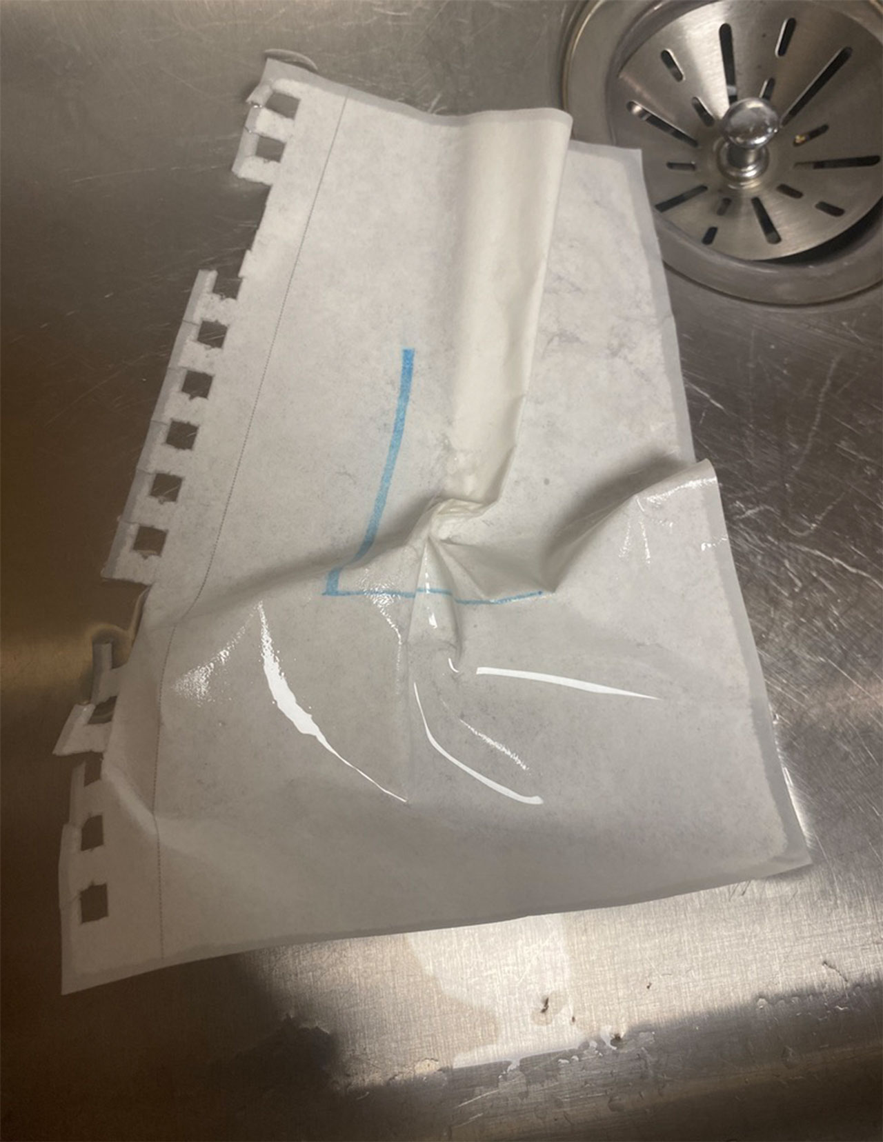
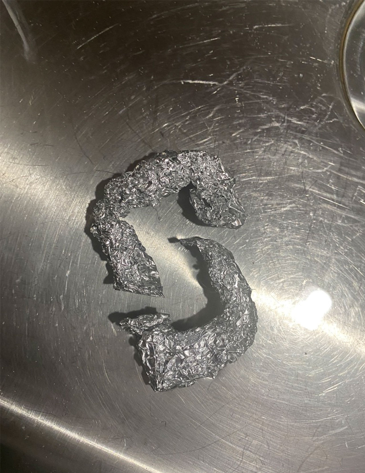
The second phase of experimentation was about the materials and lighting. I had a lot of fun with this one, especially with the lighting part. I was testing out different materials like paper and water, but I didn’t like what I was using. So, I decided to use tin foil next, and I really liked how it turned out. It was fun shaping the foil into a ‘L’ and useing the light to show it shadow and highlight.
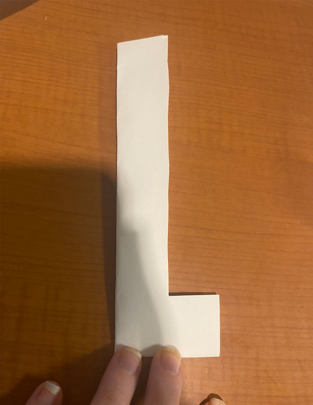
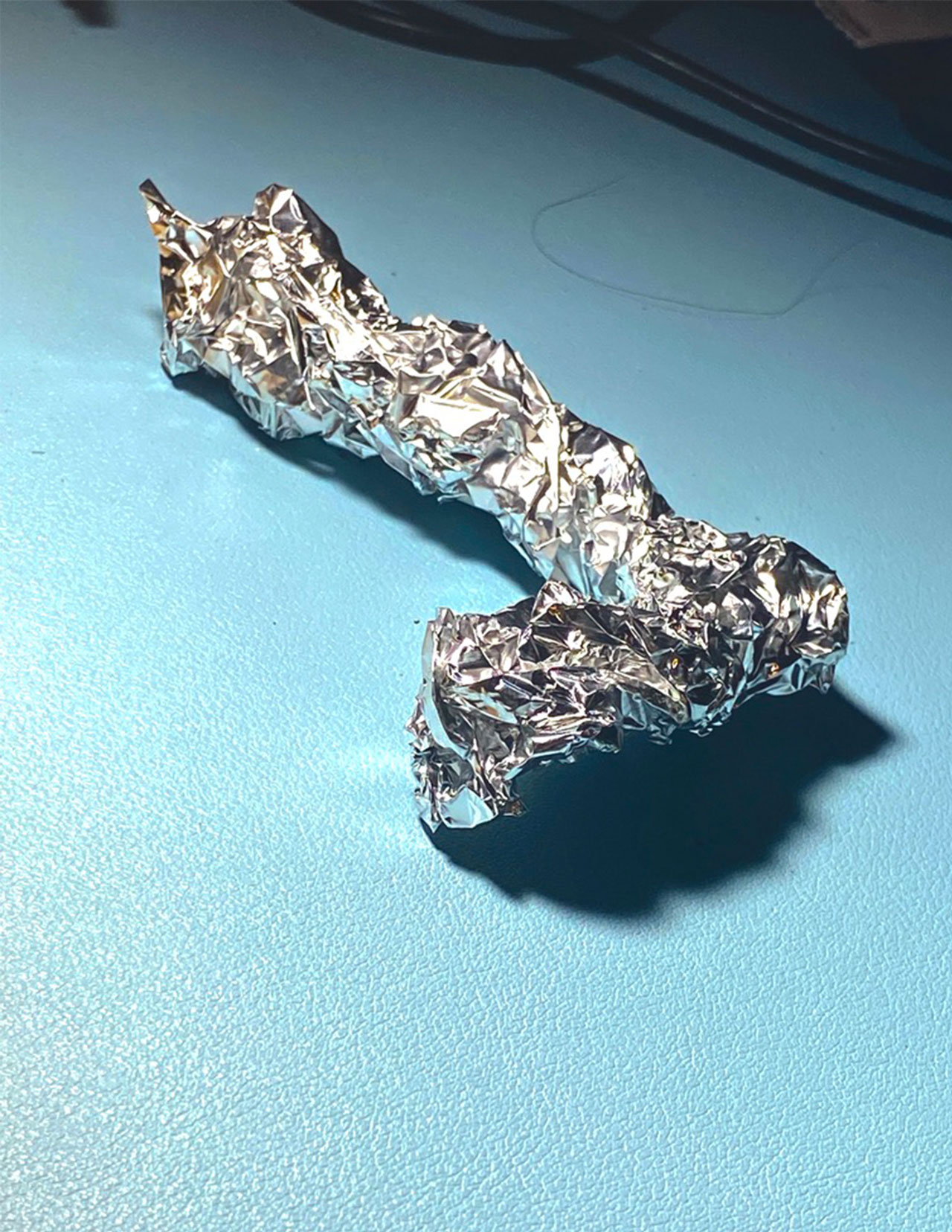
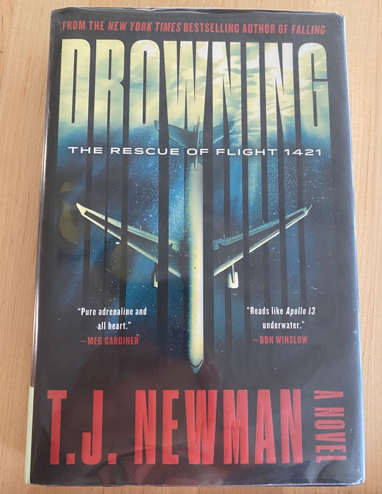
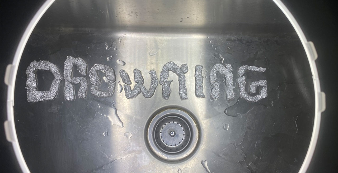
The third phase is deciding on the book I wanted to cover and plan out the layout of the design. I decided to use the book Drowning: The Rescue of Flight 1421 by T.J Newman. I love how the cover looked like and wanted to put my own spin to it, while using tinfoil. I did the title Drowning, which did took me awhile due to being multiple pieces. I then tried multiple ways of layout, one I just laid it out on my desk, the other was puting the letters in the sink with water, but I did like how it looked. With the help of my professor and friends, we worked together and found the right style of layout: the letters in the sink with splashes of water around and using the ring light, which help bring the light and shadow of the letter but also make it so that it look like a plane window. I finally got the design I like.
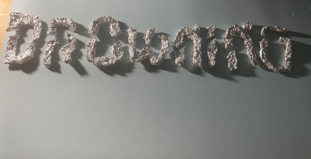
In the final phase, I officially started the project! I wanted to make it so that it’s in theme with the book, but also make it different. So, with the fonts that I had made, I went into Photoshop/InDesign and did my magic. Here are some screenshots of parts of the book design.
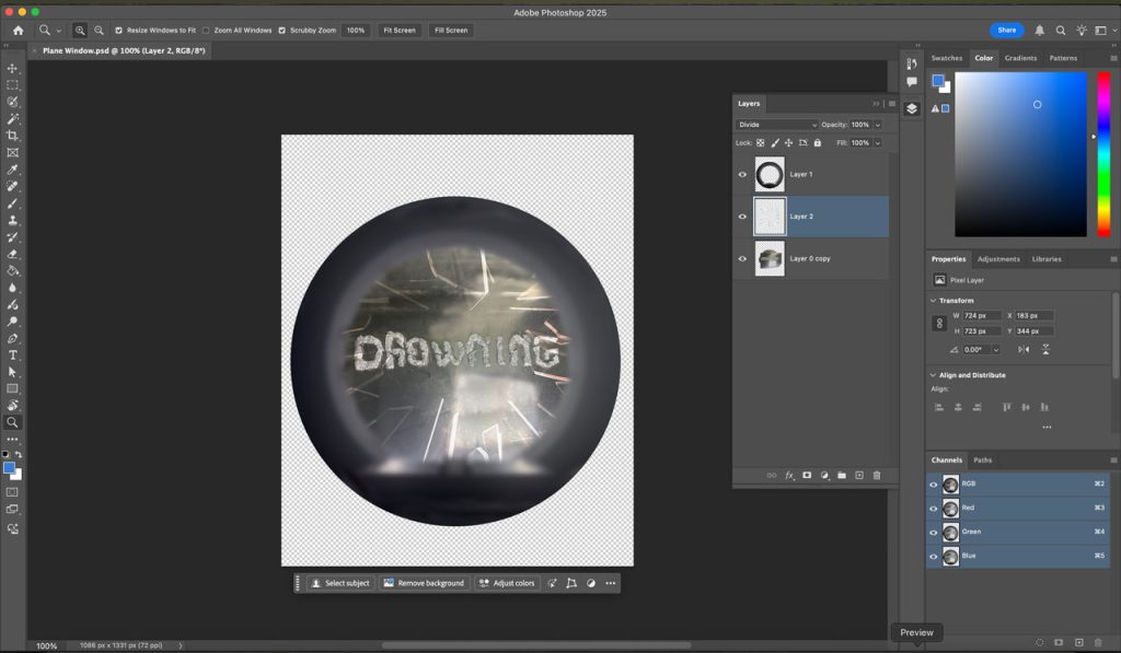
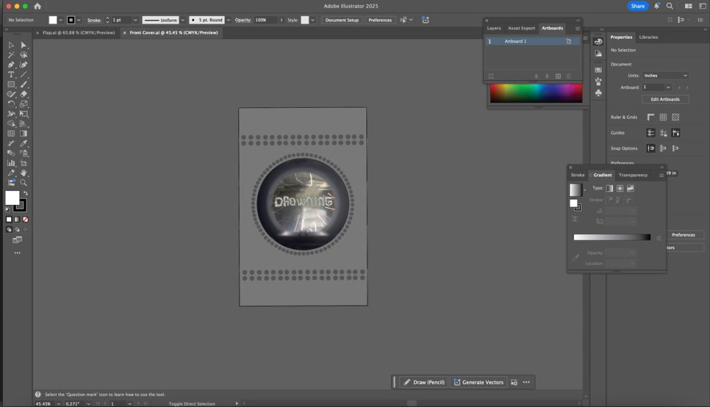

Final Book Jacket
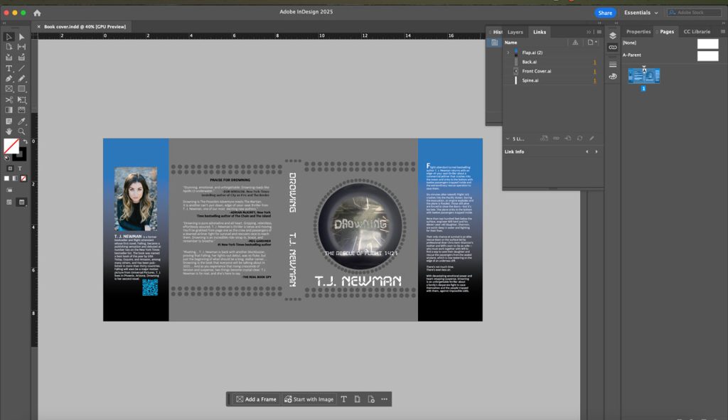

With how the final book jacket look, I’m proud how it turned out. The book I chose is called Drowning: The Rescue of Flight 1421 by T.J Newman and I wanted to fit the theme of the book but put in my own spin into it. Over the experimenting process, I had struggles over the type of materials I wanted. I was using varieties of materials and food to see what would fit my design I wanted for the book jacket. But luckily, I found the tinfoil and used them for my typography. The tinfoil looked like a material that plane are used, like metal, and thought that was a cool touch to it. I made my words, added water to it, took a picture of it, and did some photoshop to it to start the process of making my jacket. WIth how the book jacket turned out, showing the word “DROWNING” as it center, as it is being looked at through a plane window, and how everything else look like a plane as the sides look like the ocean, it turned out how I wanted it to be.
Edible Book Festival at RWU
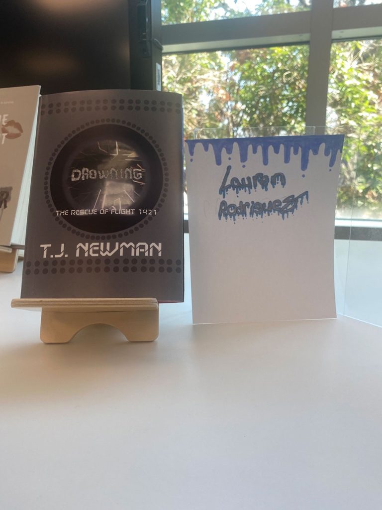
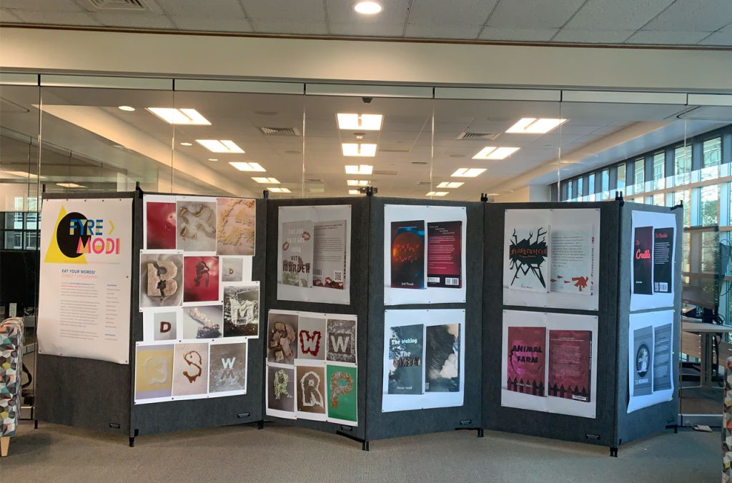

My book was able to be shown into the Edible Book Festival at Roger Williams University in the library. The Edible Book Festive is where people can show off their barkey through books, poetry, or any other writing form that tells a story. WIth my class, we didn’t do the food aspect but use physical materials for our book design. It was cool to see mine and others from my class work we have done over the semester.