
The topic I decided to choose is what life is like for vision-impaired people. As someone who is vision-impaired, this topic is very personal for me, and I want people to be educated about this. For this phase, I have to find images for irony, shock, emotions, fact, instruction, and coding that fit the topic that is chosen.
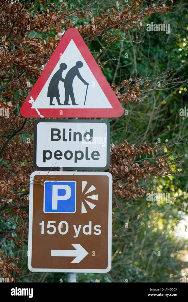
This image about the irony of the fact that theirs a warning sign for blind people at a viewpoint.
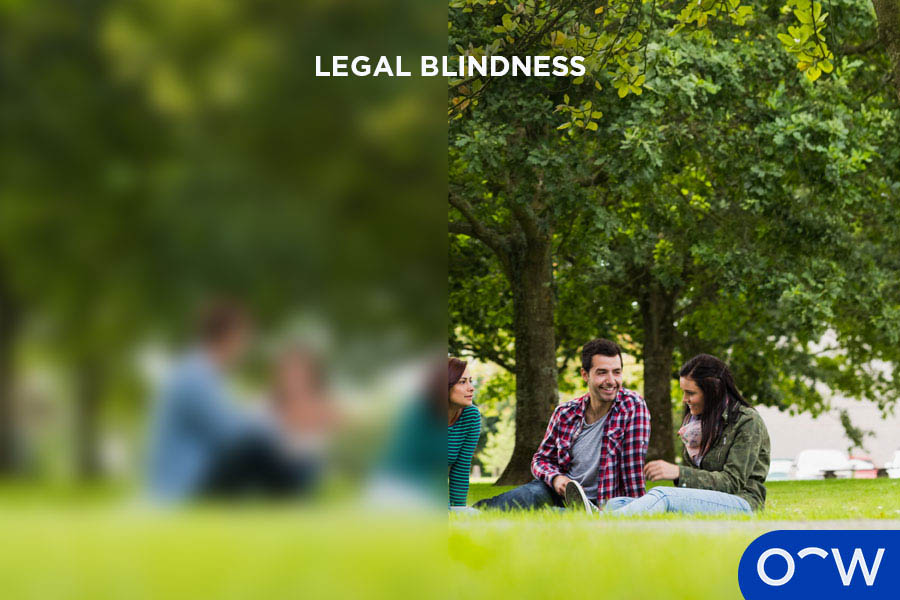
This image shows the differences between someone who has 20/20 while someone who is vision-impaired.

This image shows that 15% of people around the world are totally blind. This will happen to me in the future.
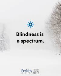
This image shows that blindness is a spectrum, which is true. There are multiple ways to be blind, and a bunch of symptoms that affect a person’s way of seeing.
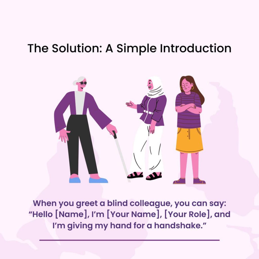
This image shows how to communicate with someone with blindness.
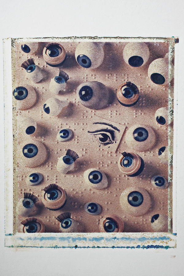
This image shows scattered eyeballs on a paper that is brailled.
Final Riso

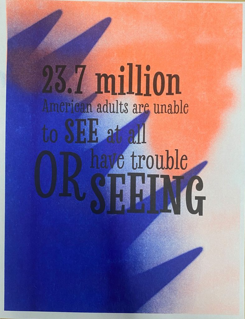

With my final Riso Print, I wanted to talk about what it is like for someone who is vision impaired because, from personal experience, not a lot of people understand or comprehend that. This is for people that are not educated about the vision loss and how its important to understand that. With the way I did, I wanted to show the different between two type of vision-impairment, blurriness and total blindness. With the blurriness side, I draw a landscaped and blurred it a bit, and with the Riso, I chose a light color to show the metaphor that they can still see lightness and colors. But with total blindness, I made it so that it look like a black curtain suddenly appeared, which is a common occurrence for retinal detachment. And with the Riso, I made that side a darker color to show the metaphor that there is nothing to see. The message to this to show the shocking and factual point about vision impairment, “23.7 million American adult are unable to see at all or have trouble seeing.”
After completing the project, in class, we did a group peer-review on our project and talked about what we liked and what needed to be changed if we had time to do so. In my group, I received the idea to test out different colors to use on the Risco, still showing the symbolism of darkness (Bindness) and lightness (Bluriness). One of the ideas was to use red for one of the side colors, probably in the lightness section. I was also told to test out the opacity of the colors. Another thing I was told was that one of the words I describe my work was ‘Scary’, even though to the people it wasn’t, but to me it was. So I should use something different or try to make it scary, but I haven’t decided what’s best. In the near future, if I had more time, to experiment with different types of color on the Risco and see what I like the most and fit the symbolism of my piece.